
Named HTML Slots & Custom UI Injection
Because RapiDoc is encapsulated in a Shadow DOM, external DOM elements cannot be arbitrarily injected into its tree. Standard Web Component <slot> elements expose designated insertion zones where you can inject custom HTML markup directly into RapiDoc's internal layout.
Physical Slot Placement Architecture
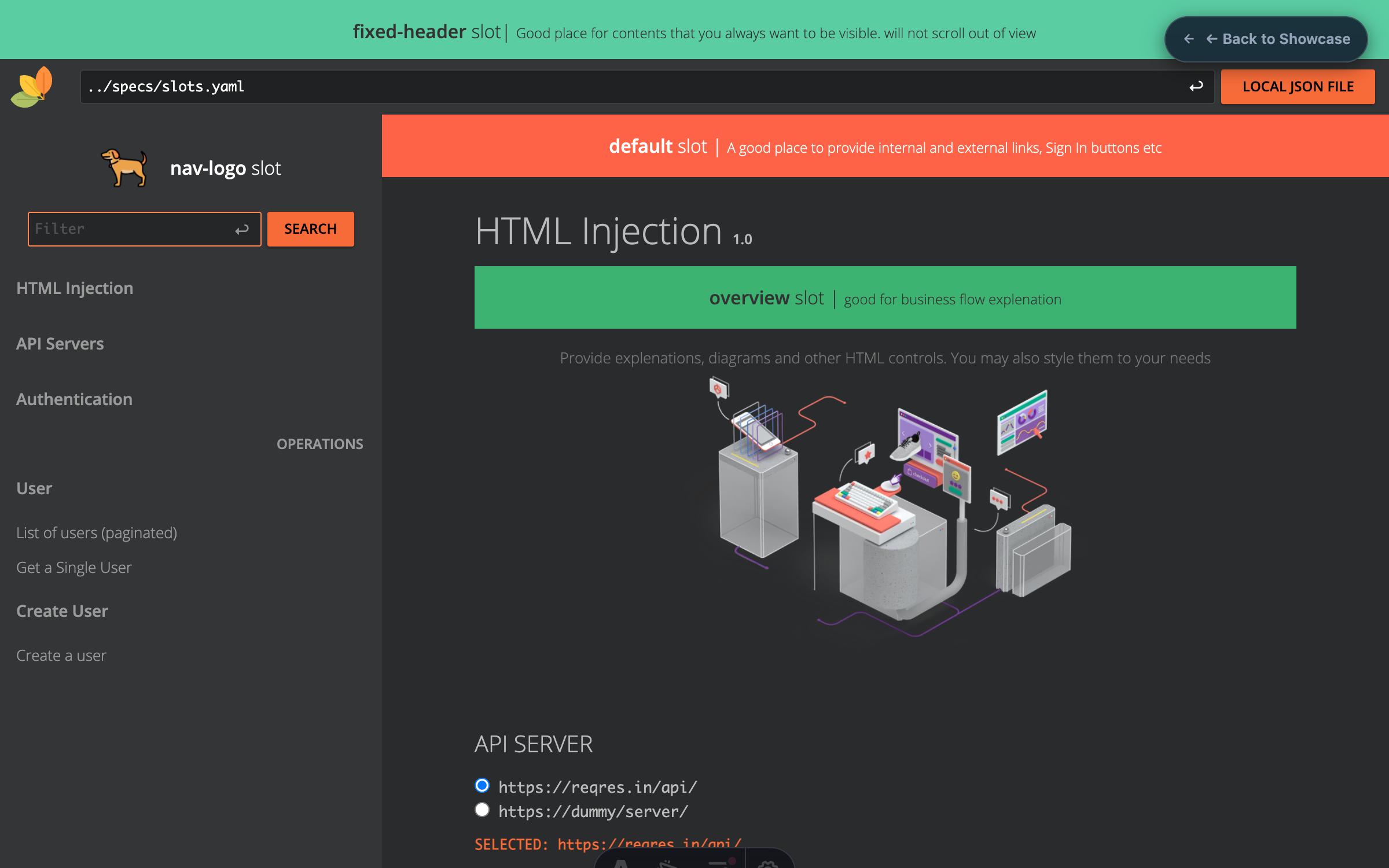
Inspect the visual map below to see exactly where each named slot renders within RapiDoc's user interface.
Production Portal with Custom Slots
Combine un-slotted announcement banners with targeted slot="logo", slot="nav-logo", slot="header", and slot="footer" elements.
Full Portal Slot Composition
Pass arbitrary HTML elements (images, buttons, alerts, links) directly as child elements of <rapi-doc>.
<rapi-doc
  spec-url="https://petstore.swagger.io/v2/swagger.json"
  theme="emerald"
  color-scheme="dark"
  radius="md"
>
  <!-- 1. System announcement banner (unnamed default slot) -->
  <div style="background: rgba(16,185,129,0.12); border: 1px solid rgba(16,185,129,0.3); border-radius: 8px; padding: 12px 20px; margin: 16px 24px;">
    <strong style="color: #34d399;">🚀 API v3.0 Live in Production:</strong>
    <span style="color: #e2e8f0; margin-left: 6px;">New webhooks and streaming endpoints are now available.</span>
  </div>

  <!-- 2. Custom brand logo in top utility header -->
  <div slot="logo" style="display: flex; align-items: center; gap: 8px;">
    <img src="/assets/images/logo.png" width="30" height="30" alt="Acme Logo" />
    <span style="font-size: 18px; font-weight: 700; color: #fff; letter-spacing: -0.02em;">Acme Cloud</span>
  </div>

  <!-- 3. Action button slot in header -->
  <div slot="header">
    <a href="https://github.com/org/repo" target="_blank" style="color: #94a3b8; text-decoration: none; padding: 6px 14px; border: 1px solid rgba(255,255,255,0.1); border-radius: 6px; font-size: 13px; font-weight: 500;">
      GitHub SDK ↗
    </a>
  </div>

  <!-- 4. Sidebar wordmark branding (sticky top of navbar) -->
  <div slot="nav-logo" style="padding: 12px 16px; font-weight: 800; font-size: 16px; color: #10b981; letter-spacing: -0.01em;">
    ACME API PORTAL
  </div>

  <!-- 5. Custom Auth guidance inside Security dialog -->
  <div slot="auth" style="background: rgba(56, 189, 248, 0.1); border: 1px solid rgba(56, 189, 248, 0.25); border-radius: 8px; padding: 12px 16px; margin-bottom: 16px;">
    <p style="margin: 0; font-size: 13px; color: #cbd5e1;">
      🔑 <strong>Need an API Key?</strong> Generate sandboxed tokens in the
      <a href="https://dashboard.acme.corp" target="_blank" style="color: #38bdf8; font-weight: 600;">Developer Console</a>.
    </p>
  </div>

  <!-- 6. Corporate legal footer -->
  <footer slot="footer" style="text-align: center; padding: 32px 24px; color: #64748b; font-size: 13px; border-top: 1px solid rgba(255,255,255,0.06); margin-top: 48px;">
    © 2026 Acme Cloud Corp. All rights reserved. •
    <a href="/terms" style="color: #94a3b8; text-decoration: none; margin: 0 6px;">Terms of Service</a> •
    <a href="/privacy" style="color: #94a3b8; text-decoration: none; margin: 0 6px;">Privacy Policy</a>
  </footer>
</rapi-doc>Tag-Specific & Endpoint-Specific Slots
In addition to structural container slots, RapiDoc provisions dynamic slot names for every tag group and operation based on its OpenAPI element identifiers.
Targeting Tag Groups:slot="tag--{name}"
Inject domain notices, common authentication headers, or SDK snippets directly underneath a specific OpenAPI tag heading.
<!-- Inject targeted notes underneath a specific tag group -->
<rapi-doc spec-url="https://petstore.swagger.io/v2/swagger.json">
  <div slot="tag--Pet" style="padding: 12px 16px; background: rgba(16, 185, 129, 0.1); border: 1px solid rgba(16, 185, 129, 0.25); border-radius: 8px; margin: 12px 0;">
    <strong style="color: #34d399;">Pet Operations Notice:</strong>
    <span style="color: #cbd5e1;"> All pet IDs must conform to valid UUID v4 strings.</span>
  </div>
</rapi-doc>
Targeting Operations:slot="{method}-{path}"
Inject live status callouts, edge caching hints, or code generation widgets directly inside an individual endpoint card.
<!-- Inject custom guidance inside an individual endpoint card -->
<rapi-doc spec-url="https://petstore.swagger.io/v2/swagger.json">
  <div slot="get-/pet/-petId-" style="padding: 10px 14px; background: rgba(56, 189, 248, 0.1); border: 1px solid rgba(56, 189, 248, 0.25); border-radius: 6px; margin: 10px 0;">
    💡 <strong>Edge Caching:</strong> Responses for this GET operation are cached at Cloudflare edge nodes for 60 seconds.
  </div>
</rapi-doc>Complete Slots Reference Catalog
Review all available slot identifiers, physical locations, and recommended use cases. Click any pill to copy the slot attribute.
| Slot Name | Physical Placement | Description & Common Use Cases |
|---|---|---|
| Below header, above Overview section | Un-slotted child elements placed directly inside <rapi-doc>. Renders at the top of the main canvas. Ideal for system status alerts, migration warnings, or welcome banners. | |
| Fixed at the very top of document viewport | Contents that remain permanently pinned at the top and do not scroll out of view. | |
| Top utility header (left) | Replaces the default RapiDoc brand logo with your custom company logo image, SVG, or interactive home link. | |
| Top utility header (right) | Renders custom HTML or buttons after the spec URL input bar. Ideal for GitHub links, external documentation, or environment selectors. | |
| Bottom of document canvas | Appends custom markup at the very end of the documentation. Ideal for corporate copyright notices, terms of service, and support contacts. | |
| Top of sidebar navigation | Custom branding image or wordmark placed at the top of the sticky sidebar (available in read render-style). | |
| Inside Authentication / Security modal | Displays custom guidance, API key generation instructions, or company SSO login buttons inside the auth dialog. | |
| Inside Overview summary panel | Custom HTML injected inside the API overview card directly underneath the document title and description. | |
| Inside Server configuration card | Custom HTML injected inside the server selector panel. Ideal for environment advisories or uptime links. | |
| Directly above operations list | Global notices, common request headers, or standard query parameter rules applicable across all API calls. | |
| Underneath specific tag section | Custom HTML injected below a tag group header. Format as tag--{name} (e.g. slot="tag--Pet"). | |
| Inside specific operation card | Custom HTML injected into a single endpoint section. Format as {method}-{path} with hyphens (e.g. slot="get-/pet/-petId-"). |
Looking for CSS Shadow Parts or Themes?
Explore our Custom CSS guide to style internal elements with W3C Shadow Parts, or check out our Themes guide for built-in color presets and design tokens.